
K'O
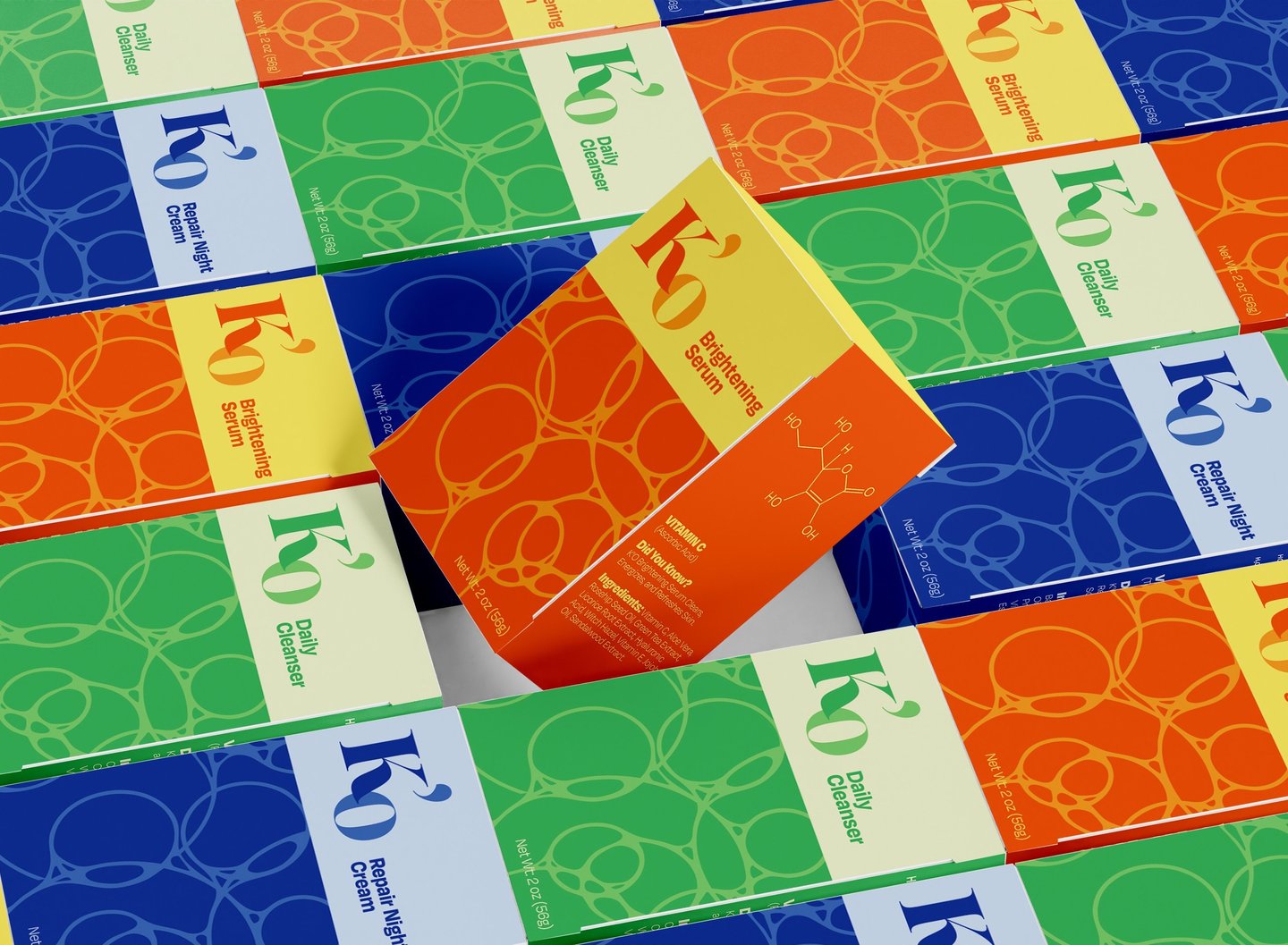
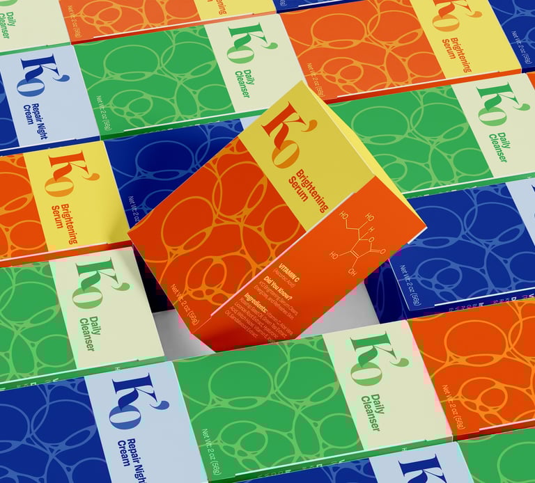
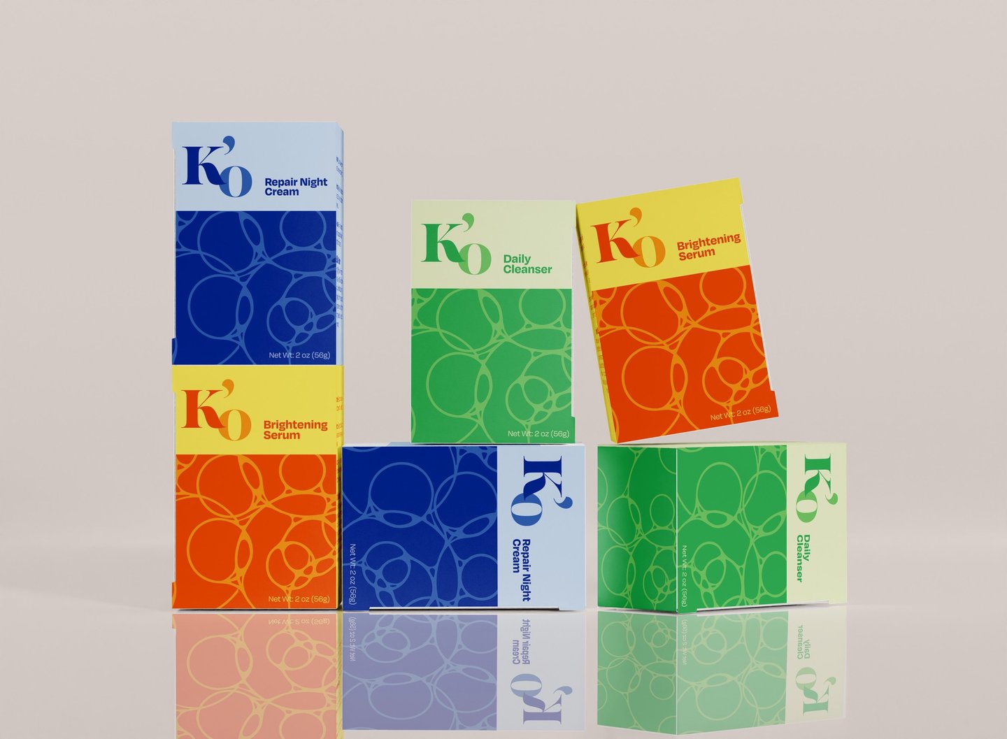
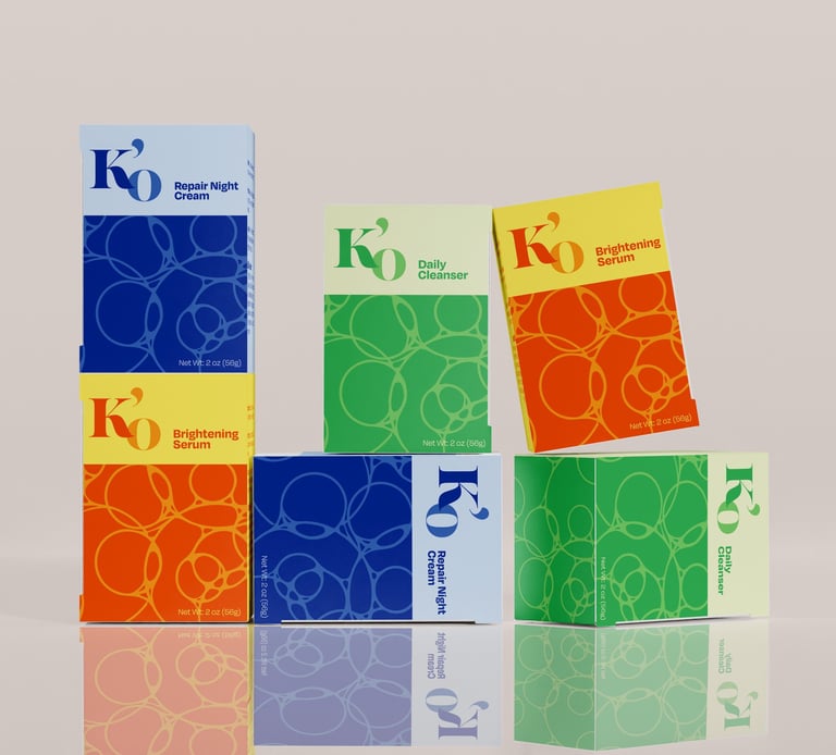
K’O is a men’s skincare brand built to dismantle the tired stigma that grooming weakens masculinity. It champions confidence, discipline, and self respect values, rooted in the modern man’s pursuit of purpose and progress. The packaging design rejects the dull, over-minimalized landscape of men’s skincare, replacing it with bold, vibrant hues inspired by natural ingredients and raw energy. A refined yet grounded aesthetic balances strength with clarity, signaling purity without softness. K’O doesn’t whisper self care - it asserts it, speaking directly to men who value authenticity, balance, and intentional self improvement.
Services: Branding, Packaging
Client: K'O Skincare
Year: 2025
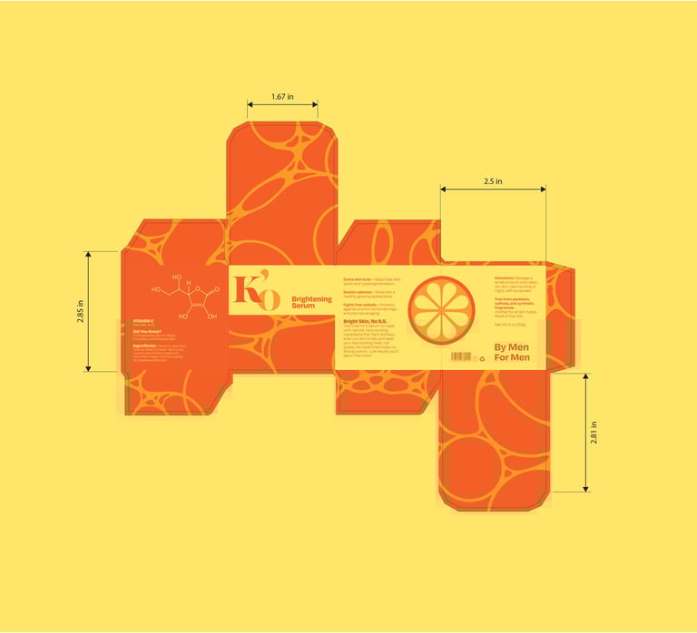
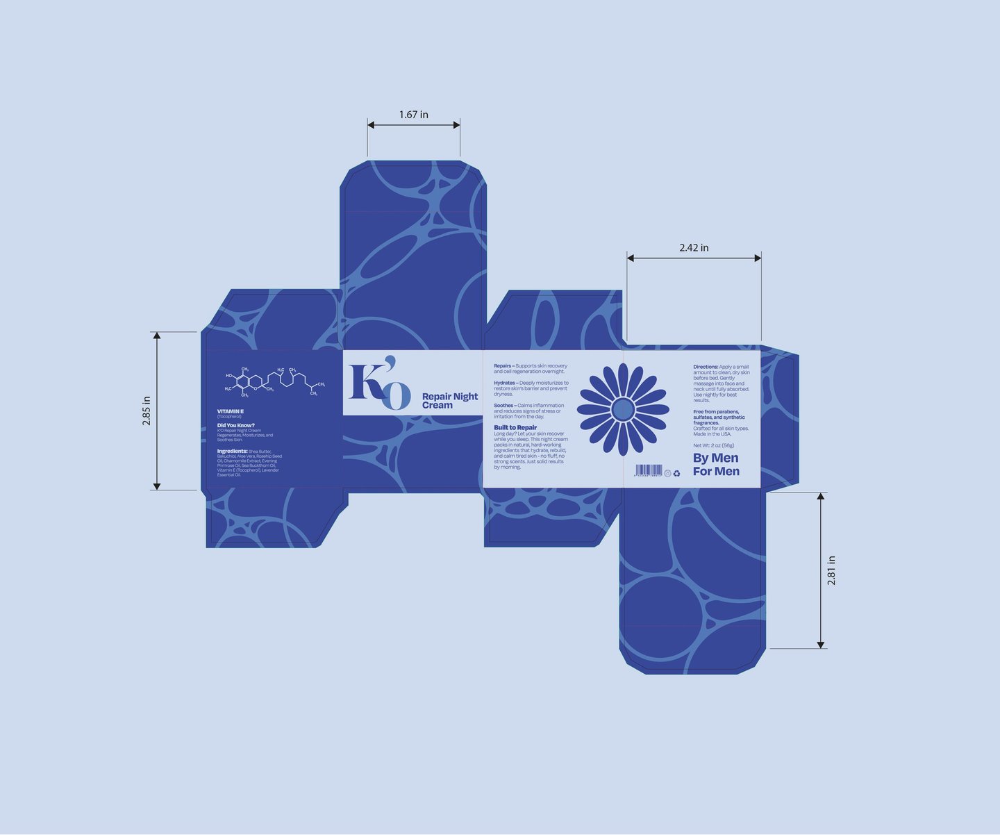
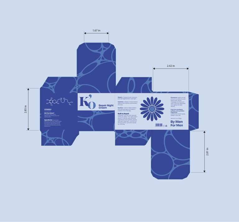
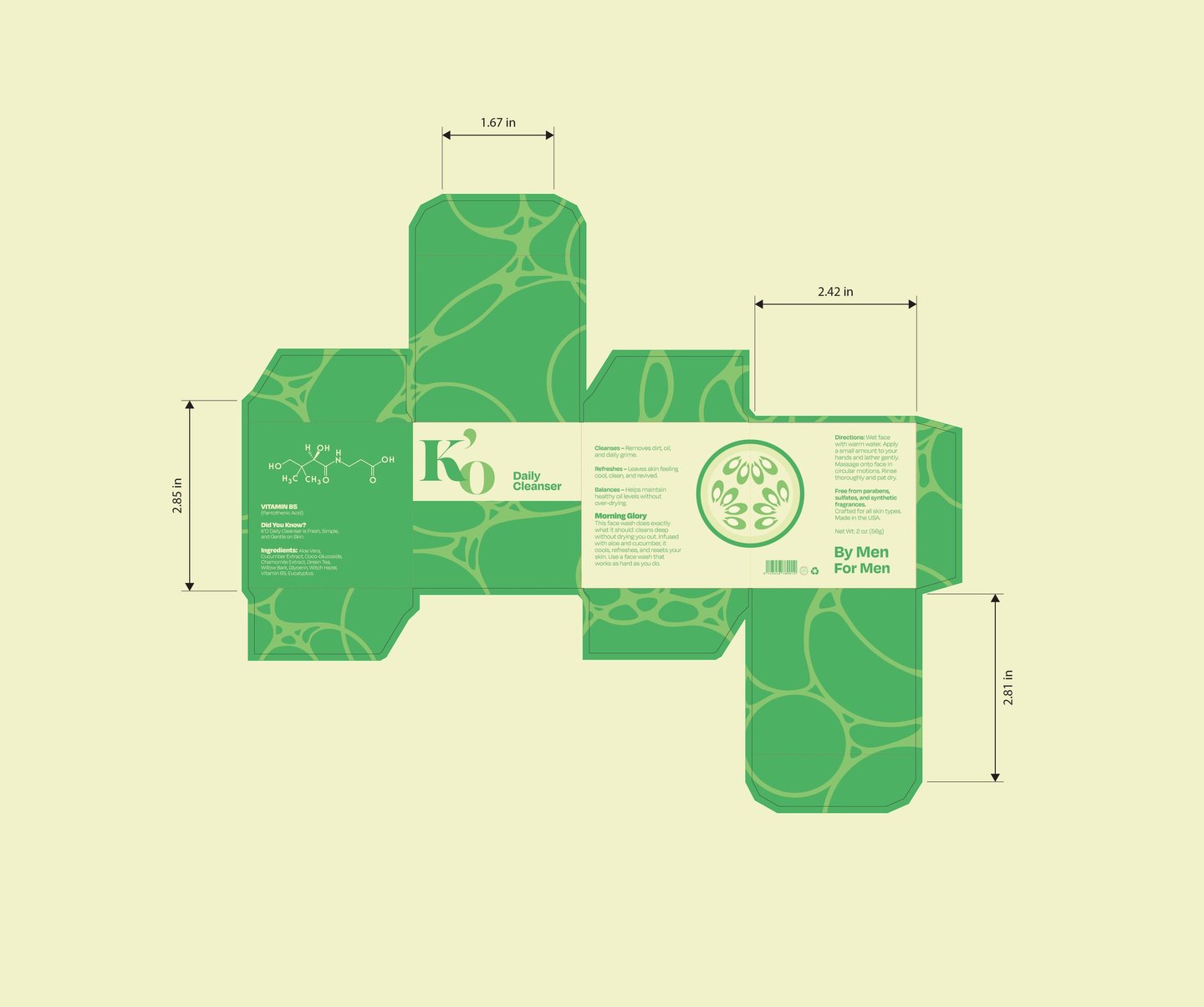
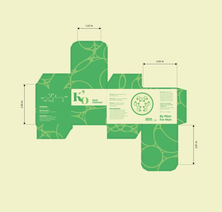
Project Summary: I developed a visual identity for K’O rooted in clarity and contrast—bold, energetic color paired with disciplined structure. The packaging is designed to be instantly legible, using chemical formulas of key active ingredients to visually communicate what’s inside before a word is read. Inspired by natural components like Vitamin C, Vitamin B5, Vitamin E, cucumber, and chamomile, the identity rejects vague branding in favor of transparency and confidence. The result is a system that feels modern, intentional, and unmistakable on the shelves, standing apart from the muted sameness of the men’s skincare market.
Design Concept: The design uses chemical formulas and ingredient-driven color to make the product instantly readable, communicating transparency, strength, and purpose at a glance. Patterns inspired by the lather of face wash add tactile energy, grounding the bold visuals in real product experience while maintaining a disciplined, masculine structure.


Other projects


Branding / Graphic Design
Graphic Design / Art Direction
